Can someone design me a logo?

GroupDIY Audio Forum

Help Support GroupDIY Audio Forum:

This site may earn a commission from merchant affiliate links, including eBay, Amazon, and others.

ruffrecords

Well-known member
Joined
Nov 10, 2006
Messages
16,940
Location
Norfolk - UK
As most of you know I make the occasional vacuum tube mixing console which go by the name of Custom Tube Consoles. For many years I have just used "cTc" as my logo engraved onto front panels. Now that UV printing of front panels is widely available I thought it was about time to get a proper logo. As all my circuit design are based on twin triodes I though it might be a good idea to have a logo made from the letters c, T and c (with the second c mirrored) to make the wh9le thing look like a stylised schematic symbol for a double triode. Some dots or dashes would be needed to form the grid and make it clear it is supposed to look like a tube.

However, I have zero artistic skills. I have played around with this idea in GIMP and Inkscape but I am getting nowhere. So, is there anyone out there who would design one for me?

Cheers

Ian
 
Random thoughts...  The c and reverse c could also be the outer edges of an infinity symbol.

Imho, it is not a bad idea to think of branding as a sigil.  As in magick.
But sigils are fairly abstract. How stylized do you want it?

It might be best to post what you've done so far, warts and all, as a step-off point for the artist.
 
Just an  observation but note that most professional logos are generally round or oval-ish or square but with rounded edges and are recognizable from a distance. This is because elongated logos usually do not fit well into many places. Consider that many graphics on the web tend to be square or round. Consider icons, emojis, favicons (the browser tab icons), avatars, etc. Also, use round / circle / soft edges and not pointy, square, sharp corners. Round is more pleasing than square (this is almost certainly why space ships in Star Wars are rounded for the good guys and pointy wedges for bad guys).

Fortunately your cTc logo has this round characteristic. So just do a circle, center the T and add the c characters on either side. Do a very large vector graphic. When that is resized to whatever size is required for the target media, it will scale better. Especially if you scale down by powers of 2 to a non-vector format. So scaling down and exporting to a bitmap (as opposed to vector graphic like SVG or PDF which is not always importable or usable with the target media) looks better when you scale down 16:1 as opposed to like 3:2 which might look distorted.
 
Heres a selection of twin tube graphics ,

The 'twin input' style seems the most appropriate , with the single anode forming the T ,


Attachments

  • twin triode graphic.jpeg
    twin triode graphic.jpeg
    31.9 KB
2nq9nx1.jpg


DaveP
 
Tubetec said:
Heres a selection of twin tube graphics ,

The 'twin input' style seems the most appropriate , with the single anode forming the T ,

At start I don't like the "smiley" looking at most of them
Finally I find it fun  :)

So dear Ian, this is a basic idea

Best
Zam
 

Attachments

  • Ian CTC Logo.jpg
    Ian CTC Logo.jpg
    54.4 KB
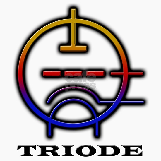
Just saw this single triode symbol online.....Guess it's part of a keepsake box or something.....

Even alone with writing below is pretty impactful as well imo.....

86_550x550_Front_Color-Mahogany.jpg


oh....someone already did that....colorless though...

images
 
scott2000 said:
Can't stop thinking of "in the box" ...lol

Yes... let say I do it on purpose... in france we call this "un pied de nez"
In the (real tube) box  ;D

Best
Zam
 
Thanks for all the great ideas. To answer your first question Boji, I want it pretty much stylised. This is a rough hand sketch I did a while back of the basic idea. I want it so because I would intend to include it on the front panel of every module much like the Neve flying 'N'

Cheers

Ian
 

Attachments

  • roughlogo.jpg
    roughlogo.jpg
    207.5 KB
Back
Top